This was the bootcamp final project which was done with a real client. The project consisted of simplifying and making more intuitive the purchase, kit activation and results delivering processes.
The main need was analysing whether the website was easy to use for all the users (current and potential users) and proposing designs aligned with Ailin's branding.
Deliverables:
Ailin is an e-commerce platform that offers kits for self made blood samples. It comes up as an alternative to traditional labs and offers a pick up service door to door. The results can be checked online on the website as well as personalised recommendations regarding users' health conditions.
Research Goal: Learn when people need to get blood samples, how they do and what pain points they find in the process.
Target: 28 - 40 year-old women who live in Spain and they have made blood sample at least once in their lifetime.
This target was chosen based on the users’ profile who use its products the most according to Ailin's metrics.
After defining the goal and target, I did secondary research in order to learn about the health industry. Also I did benchmarking to compare how national and international competitors offer their services.
8 people were interviewed and the main goal I was trying to reach through the interviews was understanding why people do blood samples; in which specific cases they need to do that, the process they follow and what difficulties they find in this process.
These are the insights I found:
People do blood samples for annual health checks
They attend private medical centres because the service is faster
The experience would be better if the process were shorter
I tested users and non-users in order to learn how people interact with the website in general and, in particular, how they buy a product.
The main insights I found were:
There is an excess of information on the website and it appears repeatedly in some sections.
Confusion on the purchase process because of some buttons and the carrousel that contains products on the homepage.
Lack of knowledge regarding the quiz which appears on the homepage and inconsistency of buttons.
I analysed the website taking into account Jakob Nielsen's 10 general principles for interaction design and I noticed that the most repetitive principle that the website didn’t comply with was aesthetic and minimalist design.
The reason for that was that all the information that was in the navigation bar sections and other pages also was showcased along the homepage. Furthermore, the images size was too big and the colour palette caused a cognitive overload on users.
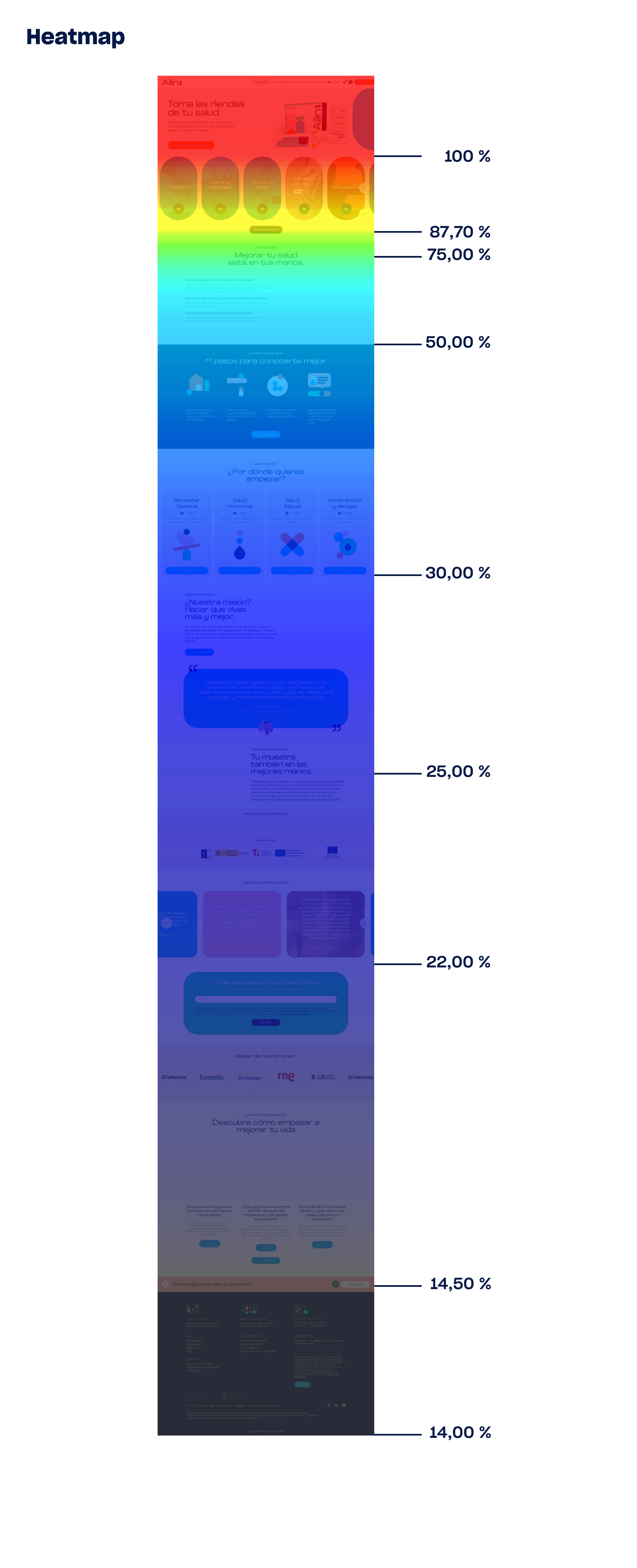
I analysed the move map which was insightful to discover that 100% of users move through the viewport, from the navigation bar to the first section of the website. This percentage decreases as we scroll down. The move map shows that only 14% of users move on the footer.
This means that a lot of important information that users need to read in order to buy the products it’s not being read.
As a conclusion of the research phase I defined the problem statement and how might we question.
Problem Statement: Users experience confusion during the purchase process due to the excess of information and its distribution on the website.
How might we Ailin’s users easily access all the information they need to buy a product?
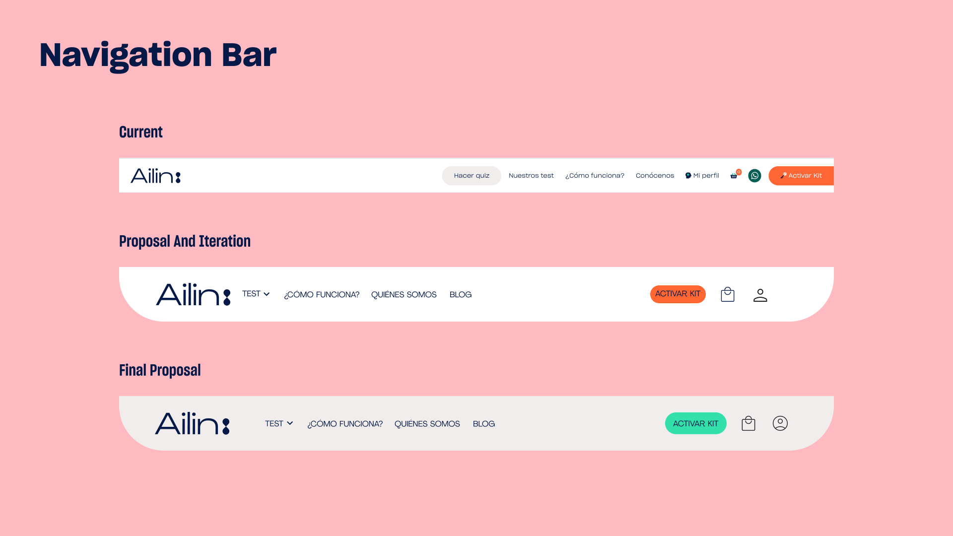
My proposal to improve the website consisted of reorganising the website information architecture.
In order to do that, the first proposal was improving the navigation bar. I redesigned it by:
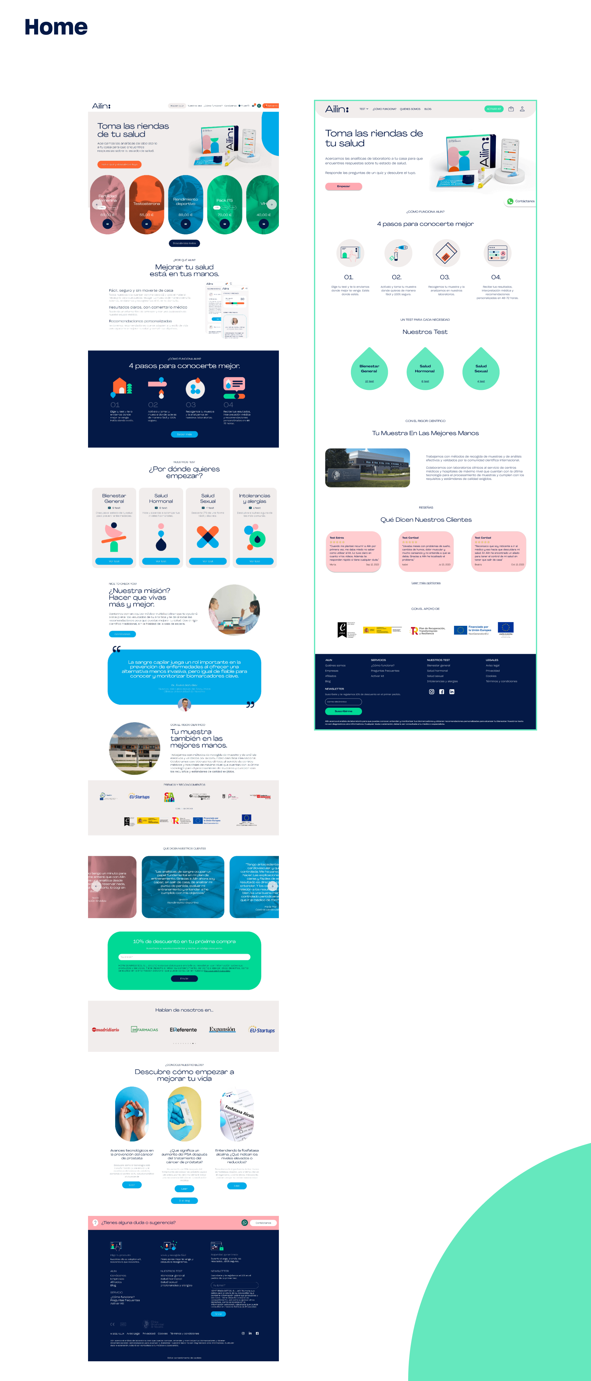
The image below shows the comparison between Ailin's homepage and the proposal made by me. Changes on the information architecture reduce the extension of the website and the cognitive load and improve the users experienc in general.
.jpg)